Read an Excerpt of ‘Dr Huxley’s Bequest’

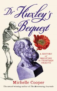
'Dr Huxley's Bequest' front coverI’ve updated my website with an excerpt of my new book, Dr Huxley’s Bequest.

There’s also a virtual tour of the real places explored in Dr Huxley’s Bequest, but it will probably make more sense after you’ve read the book. Teaching resources will be available for download in January.

Dr Huxley’s Bequest will be available in paperback and in ebook versions (epub and Kindle) later this month. I’ll put up links when it goes on sale.

Adventures in Self-Publishing: Designing a Book Cover

The first piece of advice most self-publishers hear is that there are two areas in which they must get professional help: editing and cover design. I’ve previously discussed how useful a professional editor was in preparing my manuscript of Dr Huxley’s Bequest for publication. Now I’m going to talk about cover design.

A book’s cover is a vital part of selling the book to readers, so it’s important that it conveys the book’s ideas, genre and audience in an efficient but attractive manner. There was no way I was going to attempt to make my own book cover, because I have no design expertise whatsoever. I am, however, able to recognise bad book covers and I could see that a lot of self-published book covers were absolutely terrible. Most of the companies that offer services to self-publishers include reasonably-priced cover design, but cover samples on their websites are universally awful – cheap-looking, genre-inappropriate fonts, ineptly Photoshopped across generic images. I really think this is one area where you get what you pay for.

I wanted my book to look professional, so I searched the professional directories of Australian book designers and eventually found Nada Backovic, who had lots of experience working with Australian publishers, was willing to work with a self-publisher and could fit into my publication schedule and budget. My first task was to prepare a design brief for her. This contained technical specifications (for example, the width and length of the book and the text that needed to go on the front and back cover and the spine) but was mostly about the information that the cover needed to convey. I sent Nada a one-page synopsis of the book, a sample chapter and a description of who the book’s buyers and readers would be. My book, Dr Huxley’s Bequest, involves the characters embarking on a quest to identify thirteen objects, so I gave Nada a list of these objects and included photos of those that might look good on the cover. I included some of the illustrations from the book, photos of the real-life setting, and some book covers that had appealed to me, for books about similar themes or for similar readers.

This was the stage when I began to understand the concerns of traditional publishers about marketing this particular book. It wasn’t that I’d doubted them when they said it would be too difficult to market (presumably, they knew more about book marketing than I did). It was just that I didn’t fully comprehend all the practical implications back then. I have to admit, Dr Huxley’s Bequest is a weird book. It doesn’t fit neatly into one marketing category, the way a Regency romance or an action thriller or a paranormal horror novel would. This meant that I ended up with a design brief full of contradictory statements. It’s non-fiction, but it’s a mystery story so it needs to look entertaining and fiction-y! But it’s full of history and science and ethical questions, so the cover needs to convey thoughtfulness! But also humour! And it should appeal to teenage girls, but I don’t want it to look all pink and glittery and stereotypically feminine! Oh, and it also has to appeal to parents and teachers! And I hate yellow covers! Don’t make it yellow!

It is a measure of Nada’s professionalism that she did not run screaming into the night when she received this brief, but instead quickly produced eight attractive, appropriate, non-yellow cover roughs. Four of the covers featured lots of images, effectively conveying the idea of thirteen historical objects. But these covers looked a bit cluttered and the book’s theme was already being conveyed by the subtitle, A History of Medicine in Thirteen Objects. So I concentrated on the other four covers, which were based around a single illustration of a cross-sectioned skull, with a pink tongue sticking out. It was a really good, strong image that related to the book’s themes, but I worried it might look a bit too serious and gory and put off some potential teenage girl readers. Then I noticed that some of the other covers included a composite image of two of the thirteen objects, a stone bust of Hippocrates and a skeleton illustration from Vesalius. Nada had cleverly combined them so that the Enlightenment skeleton was leaning upon the Classical bust, looking down on it with fondness and some amusement. That was it. That was the image I wanted for the cover.

But there was also the font to decide on. It’s amazing how the lettering for a title can convey so much information about the book’s readership. In the end, I thought an elaborate Victorian-style font would fit the title best, once some of the flourishes had been removed to make the lettering easier to read. The subtitle and author information would be in an old-fashioned, slightly wonky typewriter-style font that helped to convey the non-fiction nature of the book. I considered fonts that looked more ‘junior readership’, but ultimately, I didn’t think they worked. Readers drawn in by a wacky, zany title font would expect a light, fun, super-easy read and that’s not really what the book is like. It does have jokes and pictures, but it’s also fairly long and aimed at thoughtful readers.

Then came a series of small tweaks to the placement and colour of the images and text. For example, at one stage the bust of Hippocrates was staring off the page, which I thought drew the reader’s gaze away from the title, so Nada tilted Hippocrates slightly on his base, which also made the image look a bit more dynamic and amusing. I’d initially wanted the colours to be plain red, white and blue, but Nada correctly pointed out that the cover would look warmer with a cream background and more red. (We even experimented with pink text and then a pink background. It didn’t work.)

Then there was the back cover. There wasn’t much space once the text was in place, but it needed some pictures. I wondered if one of the medicinal plants mentioned in the book might suit and fortunately found a lovely red opium poppy from a historical botanical collection, as well as some vintage bee illustrations (honey also makes an important appearance in the book). Nada had the good idea of adding the poppy to the front cover, weaving it through the beard of poor long-suffering Hippocrates, then she stuck some bees on the book spine, and then we were done!

One thing I forgot to mention, which is important for self-publishers on a tight budget – if you want to use fonts or photos or illustrations, you may have to pay licence fees, unless you’re very careful and clever about your choices. In the case of Dr Huxley’s Bequest, I was able to locate appropriate historical images that were in the public domain or covered by Creative Commons licences (that is, free of charge but I needed to acknowledge the licence holder in the book, which I did). The only image I paid for were the vintage bees, which cost $36 from iStock. It’s important to note that some photos, even historical ones, can cost thousands of dollars to use. I have no idea how much it cost my American publishers to use the beautiful Frances McLaughlin-Gill photograph on the cover of The FitzOsbornes in Exile, but I’m sure it was a lot. (It was totally worth it, though. That gorgeous cover was responsible for a lot of readers picking up the book and then reading the whole series.)

Oh, so I guess I’d better show you the cover of Dr Huxley’s Bequest. Here’s the front:

'Dr Huxley's Bequest' front cover

And here’s the back cover:

'Dr Huxley's Bequest' back cover

More in Adventures in Self-Publishing

Why Self-Publish?
What’s This Book About, Anyway?
Editing
To Tweet Or Not To Tweet
Turning Your Manuscript Into A Book
All the Mistakes I’ve Made (so Far)
‘You Can Draw in 30 Days’ by Mark Kistler

I did the illustrations for my new book myself, mostly because I was on a limited budget and couldn’t afford to pay illustrator fees. These illustrations definitely don’t look like the work of a professional, which is okay because they’re supposed to have been done by the thirteen-year-old narrator. But as I was working on my less-than-perfect illustrations, I remembered how much I used to enjoy drawing when I was a teenager. I did art as an elective subject at high school and proved to be spectacularly untalented at most artistic endeavours – painting, sculpture, pottery, screen printing – although I was okay at drawing. Maybe the idea of perspectives and vanishing points and so on appealed to my nerdy maths brain. Anyway, I had so much fun doing my recent book drawings that I decided I wanted to do a bit more guided practice and eventually found this book by Mark Kistler, who apparently is famous in the US and used to be on TV.

This book was a great introduction to basic drawing techniques. It’s designed for absolute beginners with no confidence in their own abilities, so it was ideal for me, given I’d barely picked up a pencil in thirty years. There are thirty lessons, which you could do in thirty days, although I didn’t have time to spare every day for a month and so I stretched the lessons out over three months. The lessons teach the fundamental ‘laws’ (foreshortening, placement, overlapping, shadow and so on) that make pencil marks on a page look like three-dimensional objects, but it’s done in a simple, easy-to-follow manner that provides quick success and builds confidence.

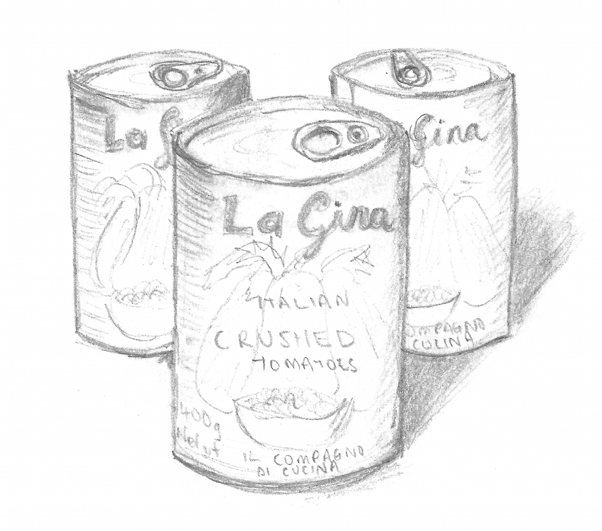
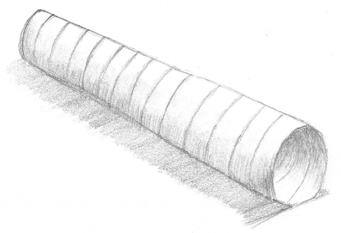
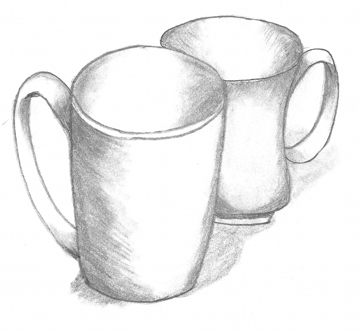
I zoomed through the early lessons on spheres, cubes, spheres inside hollow cubes, pyramids and textures, coming unstuck only when I hit cylinders. Something about the combination of curved and straight lines did my head in. But the book gives lots of practice in each skill, over multiple lessons, and so I persisted, valiantly producing wonky tins of tomatoes:

Wonky tins of tomatoes

And wonky tubes:

Wonky tube

And wonky mugs with wonky handles:

Wonky mugs

Then came interiors and exteriors of buildings in one-point and two-point perspective. Phew, mostly straight lines again, what a relief:

Sofa

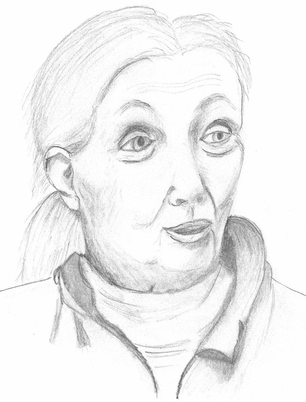
Mark Kistler is a cartoon illustrator, so he also provides instruction in some basic cartooning skills, such as 3D lettering and cartoon whooshes and cartoon planets consisting of volcano craters and levitating boulders. Then in Lesson 28, we suddenly had to draw faces. This seemed an enormous leap to me, but once I started, I realised I was using the same principles and skills I’d been practising all along. Admittedly, my first face was only vaguely face-like, but I kept going for a few days and my face drawings got better and better:

Face 1

Face 2

Face 3

The final lesson, though, was to draw your own hand. You know what fingers are? CYLINDERS! It’s also pretty difficult using your right hand to hold the pencil while you draw your own left hand. I am definitely in need of more hand-drawing practice, ideally using someone else’s hand as a model.

The good thing about drawing is that you don’t need anything except a pencil and some paper. Kistler provides suggestions for a few other useful drawing tools, but they weren’t expensive. I ended up spending less than twenty dollars in total on a nice thick sketch book, a smudging tool, some pencils and a nifty retractable eraser. Kistler is also a fan of tracing as an instructional method and he recommends a complicated arrangement involving a transparent clipboard, erasable markers and an easel. I couldn’t be bothered with that and honestly didn’t think tracing was going to help me develop my skills, so I ignored all the tracing instructions. The lessons also have optional ‘bonus challenges’ to extend your skills – sometimes I did them, sometimes I didn’t, depending on how enjoyable or interesting they looked. But by the end of the book’s lessons, I definitely felt more skilled and confident about drawing. I found I really enjoyed relaxing over a sketching activity for twenty minutes at the end of a long, stressful day and I plan to keep on drawing. If you want to learn to draw, but lack confidence and don’t want to shell out for expensive drawing lessons, You Can Draw in 30 Days is highly recommended. Two smudgy thumbs up!

‘Falconer’s Lure’, Part Eight

Summer holidays are nearly over, but first there’s the gymkhana. (I have never had to write that word before and I’m struck by how weird it is. What have horses got to do with gyms? According to my dictionary, ‘gymkhana’ was derived in the 19th century “from Urdu gendḵānah ‘racket court,’ from Hindi geṁd ‘ball’ + Persian ḵānah ‘house’ … altered by ‘gymnasium’ via Latin from Greek ‘exercise naked,’ from gumnos ‘naked’”. Maybe related to polo?)

Anyway, Nicola is riding Mr Buster, Patrick’s pony, in various ‘fun’ events like Potato Races and Musical Poles, which she’s only doing because she needs to win some money to pay for Sprog’s upkeep. When she arrives, there are a lot of Serious Pony People doing horsey things (“Nicola didn’t often feel shy or out of it, but she did now”). Worse, there are death glares from a girl who turns out to be Wendy Reynolds, the girl Lawrie accidentally imitated at the elocution competition and who mistakes Nicola for Lawrie. Uh oh…

Ginty turns up to watch, because the other Marlows are all busy killing wasps at Trennels. Ginty, it turns out, is what Nicola calls “a Pony Club type”, although maybe Ginty gets it from her mother (“Mummy was talking about hunting this winter”). So, Mrs Marlow must have had a fairly posh country upbringing, to have grown up hunting? Wendy Reynolds and her brother Oliver have TEN horses and win just about every event. But Wendy gets her revenge on the Marlows by barging Mr Buster, telling Nicola the apple in the obstacle race has a wasp on it, and worst of all, riding her horse at Mr Buster, causing him to hurt his leg and Nicola to fall off.

Patrick is quite rightly furious about Mr Buster (although, of course, doesn’t even check to see if Nicola’s hurt) and tells off Oliver. But then Peter and Lawrie arrive with a dramatic account of how the wasp-killing in the attics turned into Trennels nearly burning down and it was ALL ANN’S FAULT:

“…and there was Ann, holding a candle, exactly as if she wanted to start a fire and the beam smoking away like mad … Ann went completely and utterly mad and called the fire brigade! … And Daddy was livid and Ann couldn’t say anything, ’cos it was her fault …”

I must be missing something, because wasn’t it a good thing to call the fire brigade? They couldn’t be sure they’d put the fire out and it was a wooden roof. Unless they have to pay lots of money for the fire fighters? Is this meant to show that Ann subconsciously wants to destroy the family home? Or is this simply another dig at Ann’s well-meaning but useless attempts at helping?

Lawrie also learns about Wendy’s revenge and goes off to recite the poem again to Wendy. So there is some sort of justice for poor Nicola.

Rowan and Patrick then compete in a tense show-jumping event, which is extra-tense for Nicola because Rowan has promised to share her prize money if she wins. But alas, Rowan’s horse falls and Patrick wins! What will happen to poor Sprog now? Except then Oliver Reynolds comes up and offers Nicola all of his and his sister’s prize money. I think this is meant to present an ethical dilemma, but of course Nicola refuses the money, just as she refused to report Wendy’s cheating to the judges. I’m not really sure what this says about Marlow morality. It’s important never to make a fuss? Leave judgement of others to God?

Nicola miserably contemplates how to tell Patrick to let Sprog go, while Patrick gloats all the way back about his win. At home, he unkindly tells his father “the entire Gymkhana consisted of Marlows lying in heaps in the ring”, but then his father hands over a cheque to Nicola from selling The Boke of Falconerie. It’s for eighty-seven pounds! Nicola is rich and Sprog is saved! Hooray! Good has triumphed, courtesy of God or the Fates (or Antonia Forest).

And that’s the end of Falconer’s Lure. There was a lot to enjoy in it, but I do think my favourite Marlow book so far has been Autumn Term. I am really looking forward to getting back to the Kingscote girls in End of Term, which I’ve ordered from Girls Gone By.

You might also be interested in reading:

‘Falconer’s Lure’ by Antonia Forest
‘Falconer’s Lure’, Part Two
‘Falconer’s Lure’, Part Three
‘Falconer’s Lure’, Part Four
‘Falconer’s Lure’, Part Five
‘Falconer’s Lure’, Part Six
‘Falconer’s Lure’, Part Seven

‘Falconer’s Lure’, Part Seven

I’m sorry for the lengthy delay in blog posting, but I’ve been caught up in a flurry of self-publishing tasks (SO MUCH TO DO). Anyway, on with the reading.

Chapter X: High Diving

The Sprog is not doing well at the whole learning-to-hunt thing, so Patrick loses his temper and says they must abandon the sweet little merlin to the wild, even though he “probably wouldn’t survive the winter”. Nicola is horrified and offers to take over all his care, but Patrick refuses:

“Jael was dead, Regina had abandoned him, and The Sprog (regarded as a hawk) was useless. He didn’t want him hanging round, a reminder of better things, and, in an unhappy, dog-in-the-mangerish sort of way, he didn’t want Nicola to have him either.”

So they leave poor Sprog in a field – but he flies after Nicola and lands on her shoulder! So she is going to look after him through the rest of the holidays and then take him with her to school. Awww! I like Sprog. Even though I’m not really sure how keeping a hawk at school is going to work.

The rest of the chapter is about the family at the beach doing various sea-related activities, in their own unique Marlow ways. Nicola, for once, is merely a spectator. Lawrie forgets her swimming cap, comes spectacularly last in Beginners’ Swimming, cries about it, has to be coaxed into her diving event, performs creditably, throws a tantrum when Peter steals her wishbone at lunch, then goes off happily to her tea party with the actress-judge. As Peter astutely observes, Lawrie “might be two years younger than Nick sometimes, instead of only two hours.”

Rowan effortlessly wins her swimming and diving events. Ginty, also a good diver although she lost her last school competition, didn’t even want to come to the beach, but was forced along by the family. She decides to disappear after lunch, so she can be all special and sorrowful in solitude. She is, at least, aware that her ‘friend’ Unity is ridiculous and that it’s all posturing. I do have some sympathy for Ginty in this chapter, because if you can’t be a bit emo when you’re a fifteen-year-old girl, then when can you? Unfortunately, she hasn’t told anyone where she’s gone, which worries Karen and prompts Ann to walk all the way to Trennels and back in the heat, searching for her. Mrs Marlow is the most annoyed she’s been so far when she finds out about this, snapping: “Another time, if someone wants you to do something you don’t want to do, say so.” Except Ginty DID say so, and no one paid any attention to her! She was forced to enter the events and forced to come along! Anyway, she does end the chapter resolving to drop Unity, so that’s one good thing.

Apart from spending hours looking for Ginty, poor Ann has to put up with constant condescension from her siblings. Peter and Nicola are so blatantly rude that Rowan tells them off for being unkind, which shocks Nicola. But even then Rowan is patronising, saying “those sweetly pretty thoughts [Ann] gets are quite genuine” and “she’s a kind girl, after her fashion” and that Ann just can’t help being “sloppy”. If I were Ann, I’d leave home as soon as I possibly could. She could train as a nurse and then go off to work in Africa or somewhere else that’s far, far away from her family.

However, this chapter is mostly about Peter’s holiday finally improving. He wins his sailing race by ten lengths and his father is observed looking “surprised but very pleased” (for once). Mind you, Peter’s a Dartmouth cadet and a Marlow, so he’s had far more experience and training than any of his competitors. Nicola cheers loudly when he wins and is instantly hushed because even though Marlows are expected to win everything, one mustn’t ever celebrate that in public. Then there’s a long, tense high-diving contest between Peter and Patrick, in which Peter has to battle his fear of heights:

“He started up the ladder, thinking, as he had so often thought before, that once he’d done this, he’d find himself on the other side of fear, like jumping through a paper hoop. And then he knew he wouldn’t. There would always be more paper hoops.”

Anyway, he triumphs. But then, when Patrick goes to congratulate him, Peter snubs him! And then Patrick apologises for calling Peter a lily-livered loon and a murderer and Peter oh-so-graciously deigns to forgive Patrick! Can I just point out that Peter has NEVER apologised for putting Patrick’s life in danger on the cliffs or thanked Patrick for holding him safely in place till their rescue or said sorry for killing Jael. If anyone deserves to feel injured, it’s Patrick!

Right, that’s it, I’ve had it with Peter. He’s so awful, he makes Patrick look good.

Next, Chapter XI: The Jump-Off